Logos
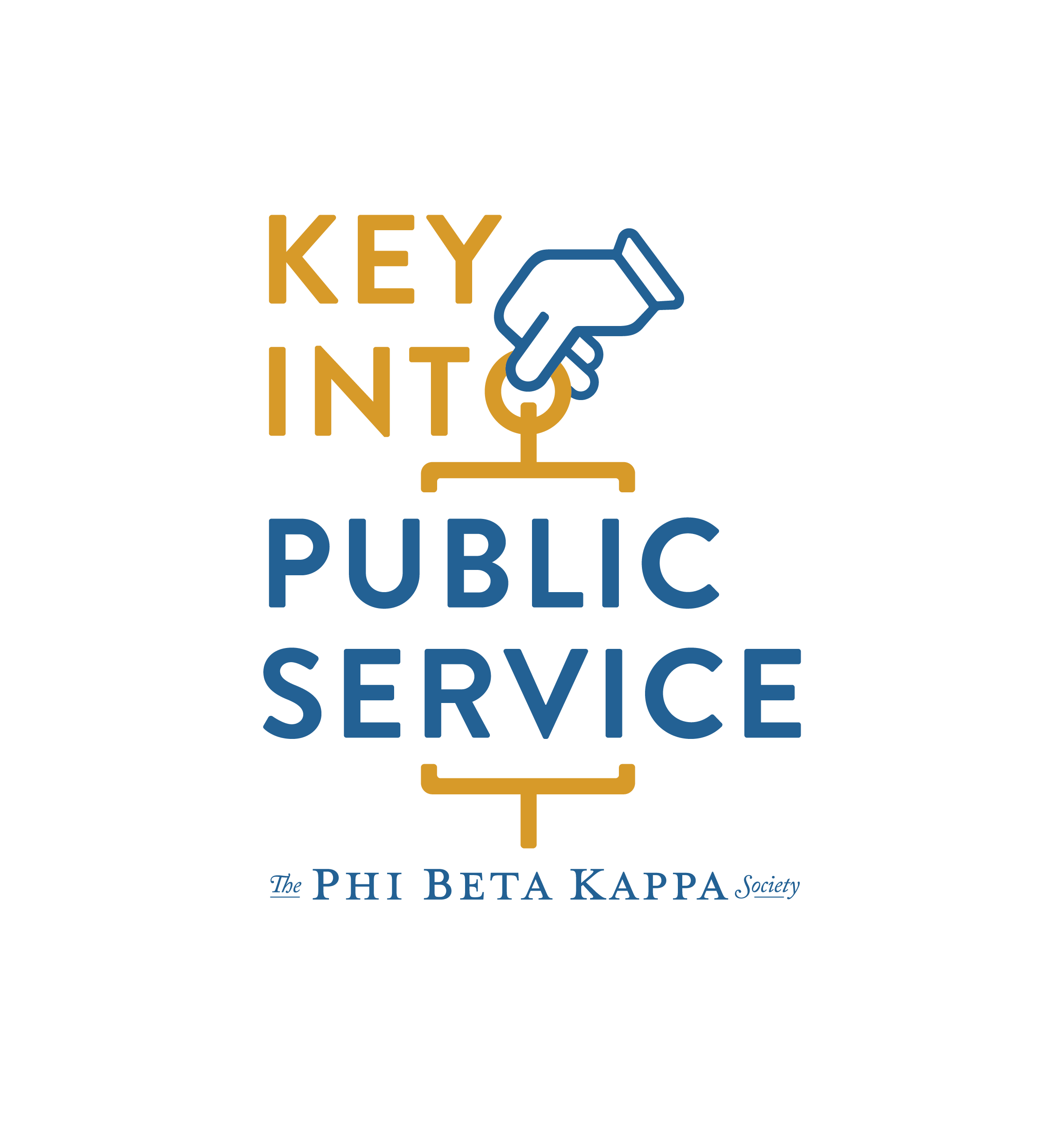
Key Into Public Service - The Phi Beta Kappa Society
BRIEF
Create logo for Phi Beta Kappa’s National Arts & Sciences Initiative program, Key Into Public Service. Must make use of the Phi Beta Kappa society’s iconic key with this logo. The final design will be a package of multiple font options, both in the branding standards blue and gold, white, as well as a horizontal and vertical arrangement. This makes the logo applicable to a variety of formats both print and digital. The fonts and colors will make use of their existing branding to create cohesiveness across programs.
Art Director: Andee Mazzocco, Saygrid
Logo Design: Lauren Ladner

MORE ABOUT THE PROGRAM
The Key Into Public Service program and scholarship opportunity highlights the wide range of opportunities for arts, humanities, sciences, and mathematics majors to pursue rewarding careers in local, state, and federal government. Selected scholar receive scholarships, mentorship and more.

PROCESS
Sketches were created trying out ways to integrate the key into the typography of the logo. This started with hand sketches and then was quickly moved into Illustrator. The hand was included to make the unique key shape more readable as a key to people unknown to the society and program. The positioning of the hand implicates the grabbing and turning of a key to really drive this concept home. The vertical and horizontal arrangements were adjusted. The final package included both logos in multiple colorways. Above you can see an example of how the logo was incorporated into a Instagram post announcing the Scholars.
DJ Nightwitch
BRIEF
Logo for DJ Nightwitch, a Dark Electronic DJ and Twitch Streamer based in Philadelphia, PA. Inspiration is all themes horror and gothic, from style and aesthetic, the the music she spins. A font in her branding package will serve as the base for the logo. Must be able to be adaptable and used across a variety of contexts.

PROCESS
After a conversation on horror, we figured out body horror was a major inspiration for DJ Nightwitch. With that in mind I created this drippy melting logo. Using the base of the font provided, I drew in Photoshop on my tablet the drip effect. From there it was moved into Illustrator and vectorized so it was easily editable. An outline was added which could be adjustable based on the context the logo was being applied. The colors could also be chosen based on the context, but the primary colors through the branding are black, white, pink and purple.
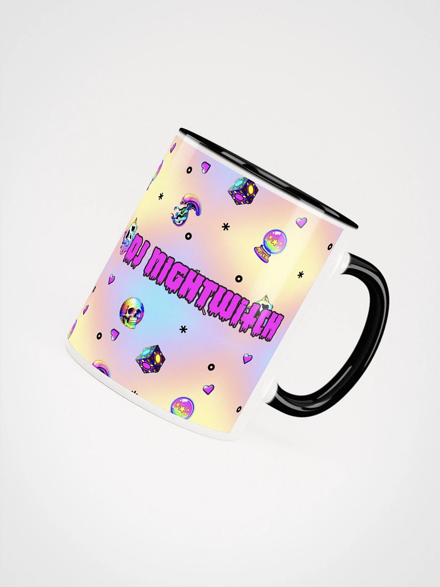

The logo has been used across her twitch stream and other social media, including Instagram and her merch store.
Waning Crescent Massage
Waning Crescent Massage came to me for this logo design, inspired by the namesake of the waning crescent . Symbolically, this moon phase represents a time for rest, healing, surrender, and self-care. Massage is an offering which provides the client with some time for recuperation. This logo incorporates those symbols in a clean and gentle way and lets the viewer know they are in capable healing hands.
Higher Priestess
This logo was created for blogger Higher Priestess. The symbols seen here reflect some of her personality, such as the Gemini symbol representing her astrology sign, the air symbol representing communication, the moon is also a symbol of intuition and the cycles of life. The cannabis leaf signifies her work as an advocate of the plant as medicine as well as her abolitionist stance of cannabis clemency, which she discusses online. These symbols are arranged on the background of stylized smoke. This logo is seen on her website, and across social media.
Matthew Mule McKinley
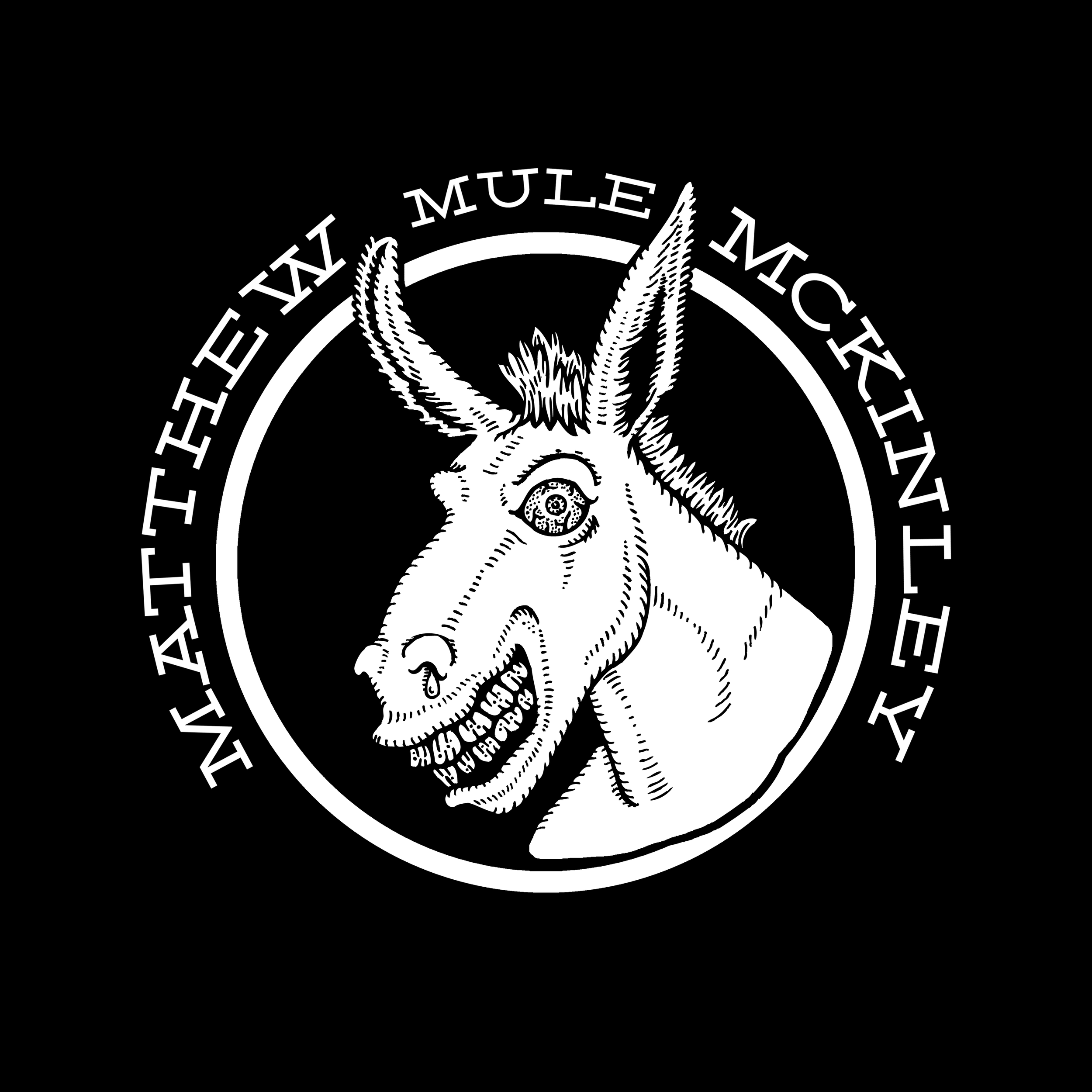
This logo was created for musician Matthew ‘Mule’ McKinley as both a logo and for application to other merchandise. The hand-drawn mule representing his on-stage persona. The style reflects weirdo art and his foot stomping mixture of roots, blues, and rock and roll.

Run Molly Run

Run Molly Run is a band whose name is based in a folk legend from where they hail in Southern Maryland. The Legend of Moll Dyer, a village healer that was chased from her home with torches, accused by the local people of witchcraft. Using that tale as inspiration, I created this logo, with the letters set ablaze, the bright green and purple adding a spectral contrast. The colors translated well to their merch, including on black t-shirts. The logo was also supplied in black and white for application on tour posters and social media.
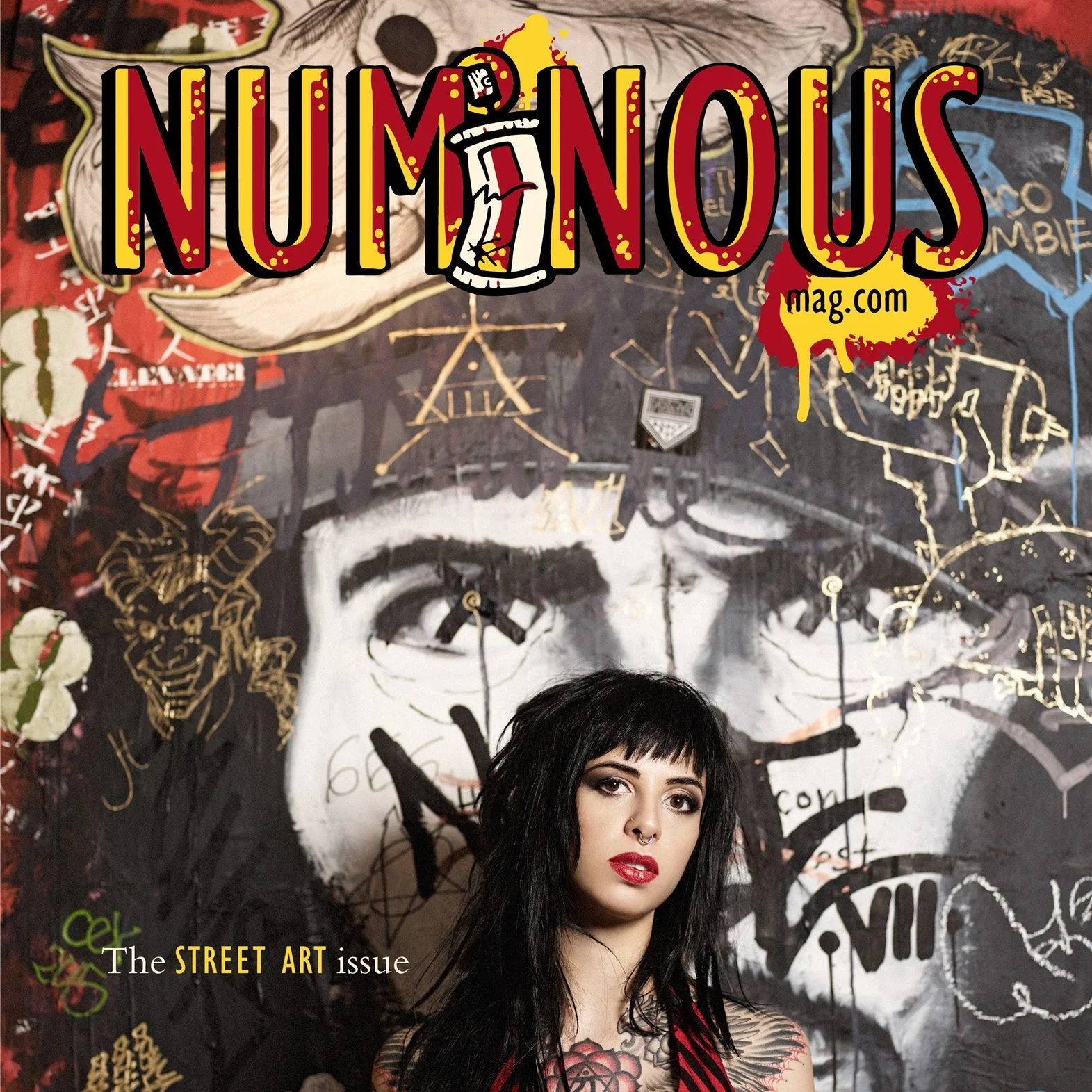
NUMiNOUS Magazine
NUMiNOUS Magazine is a seasonal fine art and high fashion publication created by artists for artists. The magazine displays pieces from artists around the globe. In every medium, from fashion photography to illustration, NUMiNOUS is meant to inspire, encourage, and enlighten. This logo was created specifically for the ninth issue, STREET ART. The brand font was used but with a street art twist. The lowercase i within the logo becoming a spray can, and the logo color being inspired by highly visible graffiti art. This logo was used across promotions both digital and print, applied to tshirts and other merch, and a color variation was used on the cover of the ninth issue.